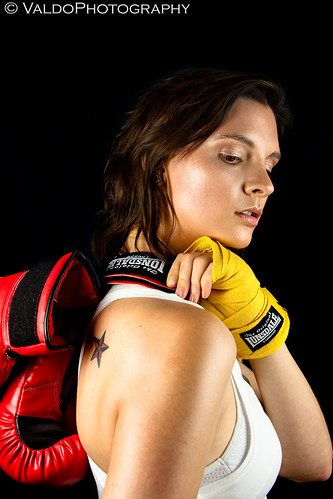
Composition I would say is the art of guiding the viewer through your image --drawing him/her to the interesting points in it. If you have read anything about composition in photography you must have read about the "Rule of Thirds". Imagine any of your pictures and divide it in nine sections of the same size (see fig. 1). This composition rule basically says that you should avoid putting your subject right in the center, instead, you should aim to position it at any of the intersections between the lines you just draw --to make the image more interesting to look at, that is the aim. And if you have a point and shoot camera and always wondered why your frame was divided in nine... now you know!

Now, I have had this rule in mind for quite some time because I don't always pay attention to it. Rules are meant to be broken right? I mean, sometimes I do believe that a subject looks better right in the centre of the image, or sometimes I consciously put the interest point a tad away from the intersection lines on fig. 1. So what?
Well this is what I found, and even though it is not "scientific" it certainly surprised me. It has to do with aesthetics and Edwin Westhoff developed a method of composition that, he argues, gives better results than the rule of thirds. He called it "The Diagonal Method". He noticed that many images from master photographers and indeed many famous paintings did not followed the "rule of thirds" precisely. He also noticed that many of those images rather followed another composition logic related to the "Golden Section" --yes, you have heard of it before "The Divine Proportion", Leonardo Da Vinci, etc. Follow the link if you are interested in a full explanation, for the purposes of this post suffice to say that Edwin devised the "The Diagonal Method" around that logic and came up with the following way of dividing the frame: imagining two overlapping squares and drawing diagonal lines across them (see fig. 2).

You guessed right, interest points are intended to be over any of the diagonals. And IT REALLY WORKS!!! So much actually that Adobe included the Diagonal Method in Lightroom!!
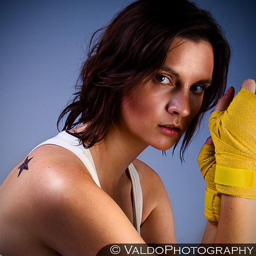
Remember the image at the top? well I did some serious cropping without knowing this technique, I even used a different ratio (1.85:1) than the ones I normally use (6x4, 6x6) and IT TOTALLY MATCHES WITH THE DIAGONALS!! check the next image with the diagonals included:

As you can see, one of the diagonals crosses the eye perfectly and another comes in between the feet of the model!! which are the things I intended you to look at. I was totally
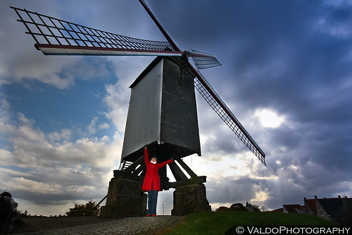
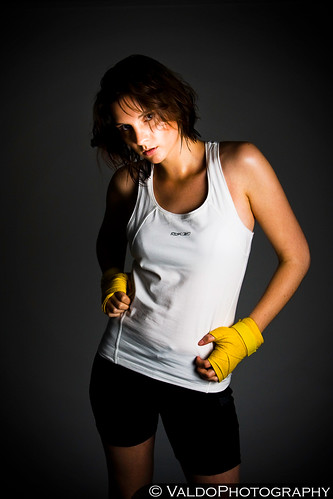
See more images after the Jump. And trust me, I cropped them before knowing this Golden Section logic and they match either perfectly or within a couple of mm.
___________________
Not perfect but very close!

Bang on:

One last one:

So maybe we do like those proportions. You don't have to know much of aesthetics but normally you do know what you like and what you don't. Give it a try and see if you images are more pleasing this way.
More>>
